Restaurant - Hakkasan
This split level Michelin-starred restaurant is located in central London.The reception, bar and assocciated dining area at ground floor level then guests can take the theatrical stair down to the lower-ground dining area below.
The concept design was created by Guillaume Richard and we were the Executive Architect team responsible for developing the drawings and co-ordinating the construction. The guests experience evolves as people move through the space, the journey is a movement through layers being slowly revealed. The scene is set immdeiately by intimate lighting, tactlie materials and attention to detail and the lights guide you to reception.
The ground floor’s entry sequence features a long corridor, low ceilings and luxurious baritone materials, including mahogany, stone, marble and bronze. There is a view ahead to the feature stair and the lower level.
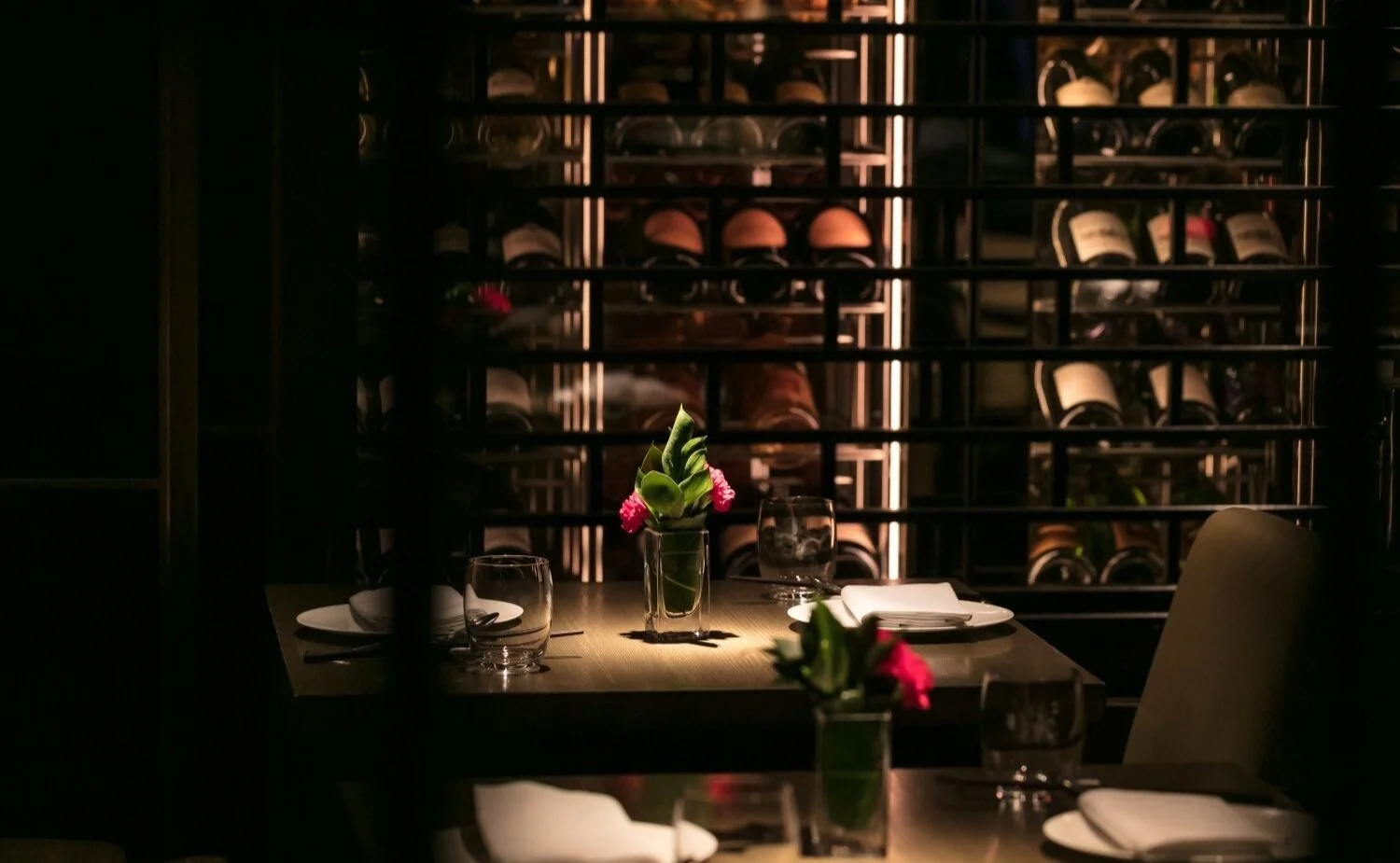
The joinery and the upholstery are highly detailed and the wine display is a strong focal point on the lower level.
A great deal of desing attention is given to the ceiling planes in both dining areas to create distinct zones and showcase a dedication to detail and storytelling.
Downstairs, the intimate atmosphere continues due to very localised lighting, dark and rich materials and the careful placement of screens to obscure and frame views. The main kitchen is on the lower level too.
Alan Clayton developed the kitchen design. The limited space and the lower ground location made this quite complicated to coordinate regarding equipment delivery and servicing, MEP coordination and waste management.
The lighting on the feature stair is crucial (image above) the perimeter of the stair is highlighted with concealed light so that the step levels can be identified then the gobi projection sets the mood.
This project offered many interesting challenges, the site was fairly tight and some parts were difficult to access, the level of detailing required for the design was high. This is a prime location in an expensive city so all the space needed to be maximised and the ceiling heights in the lower ground area were fairly low which isn’t typically associated with grandeur and luxurious spaces. Flexibility and adaptability were very important for this project.
Image credits: All images on this page c/o Hakkasan.com
Collaborators - Kristoff Dubose, Alan Clayton, Paul Nulty, Guillaume Richard


