Spotlighting British fashion designers
Spotlighting British fashion designers
People live out their lives in clothes and they can transport you to a time and place. Fashion can be used as a way to express yourself or to blend in with the crowd. This hotel’s character isn’t shy so we featured 3 confident designers to inspire the renovated rooms. This project only required a soft refurbishment to the guestrooms, they wanted to change the drapes, the furniture, carpets and wallcoverings to revamp the rooms with maximum impact. We chose established designers that many of the guests would recognise even if they didn’t know much about fashion.
It’s a popular design strategy to take inspiration from hyper local sources to create a strong identity. Designers often use nuanced details to create something specific to a part of a city or island, however, this luxury hotel was better suited to link to London as a whole rather than a specific district or subculture because this was close to many tourist sites and not many people live in the area full-time. Like other hotels before, including London’s famous Claridges Hotel and New York’s St Regis Hotel, we opted for fashion design as our design anchor because this would resonate with the hotel’s existing clientele.
The 3 designers selected based their careers in London and still have a presence in the city now. We were keen to make the experience more involved so we proposed in-room media, retail opportunities and events for the guests who want to learn more about the designers or want a more engaging time. A hotel stay is a great time to explore different styles, ideas and behaviours, it’s a short term commitment that can be tried on for size.
Vivienne Westwood - Known for her controversial designs and anarchic approach this provided an interesting antithesis to a traditional luxurious hotel. A striking contrast between traditionalist, provocateur, utterly contemporary, these rooms would be impactful and unexpected. Vivienne Westwood became well known as part of the London punk scene and she continues to use her notoriety to highlight ecological causes she is passionate about. Her subversive originality has influenced many other designers.
“I've constantly tried to provoke people into thinking afresh and for themselves, to escape their inhibitions and programming.” Vivienne Westwood
These rooms would capture her spirit and her creative idealism by creating an immersive space that utilises the walls, the furniture and even the ceiling to encapsulate her dynamism. Nothing would be out of bounds, the upholstery could reflect her exaggerated sculptural tailoring. Ideally some of her clothing items will be reused for the decoration of the rooms so that the fashion fabric has a second life in this hotel. Due to technical issues around fabric durability and fire resistance this may need to be limited to smaller items but every little helps to reduce waste. For this reason, some of the fabrics shown are from previous decades.
“With Westwood, what you see is what you get – pure fashion and signature style.”- Vogue
Her doodles and sketches should be incorporated on cushions and art but also in unexpected ways like on bathroom tiles or the bathroom mirror, or on a bed canopy or inside the wardrobe.
This space should have a traditional approach to a hotel guestrooms complete with writing desk, dressing table, wardrobe and lounge seating but they should be injected with Westwoods dynamism. The native south american design for wallcovering would be juxtaposed against punk references and against her 1982 medieval armour inspired designs, expressing a disregard for style ‘rules’. Westwood is an avid scholar of fashion history so this must be well researched.
More than 40 years into her career, Westwood has become a sort of avatar of herself. It’s an idea that she plays with by appearing in her own press materials and this room could be an extension of that.
While staying here, guests could watch her documentary, read one of her books in the room and if they want to take a copy home, just add it to the bill. Music could start as soon as the key-card activates the room for an immediate experience and playlists could featuring the New York Dolls, Sex Pistols, Mae West, Billy Fury and Dominik Emrich from her catwalk shows and her early stylist days. For special occasions there might be opportunities to try on clothes from the Vivienne Westwood stores in your room. If not, the porter can immediately order a taxi to her London stores.
Paul Smith - Synonymous with British tailoring. Paul’s first ambition was to become a professional racing cyclist. However, friends at the local art college and his experience at a clothing warehouse pointed him in a different direction after he was stopped from cycling.
Paul’s approach is more refined, he creates many designs that focus on a highly considered use of colour and repetition to either create block impact or to be understated but with a hint of hidden depths. Therefore the base palette and patterns would be simple and neutral with bold blocks of colourful patterns to inject vibrancy and animation. There would be small quirks and surprises for attentive guests like obscure statues or repurposed bike parts in the interior.
Smith has also created many artworks which would be featured in the guestroom alongside photographs of some of the striped art cars created over the years.
These are spacious rooms so there would be no compromises required on storage space or lounge areas within the rooms. Some larger furniture items, like the wardrobe would be of the late Victorian style to match the age of the hotel but the looser pieces like lounge furniture would have clean lines, simple forms and would be very comfortable.
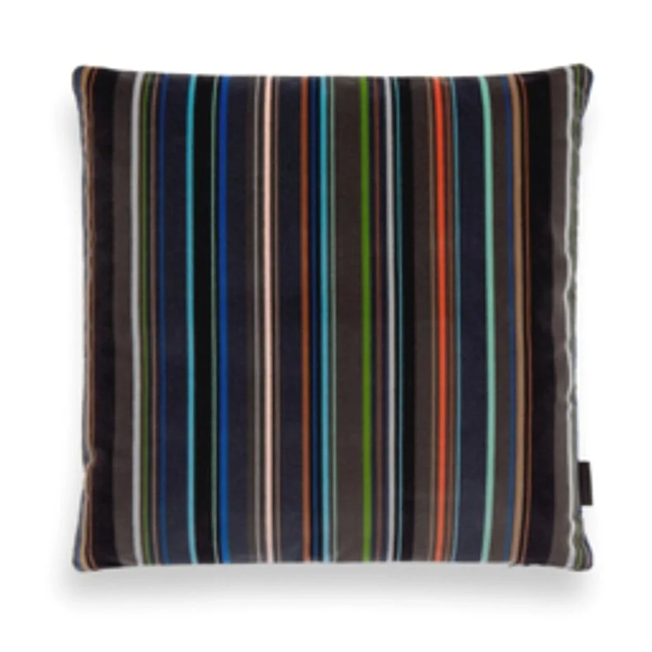
Multiple iconic stripe patterns and the Albermarle pattern inspired by the designer store would be used throughout the rooms for upholstered furniture and for cushions and throws.
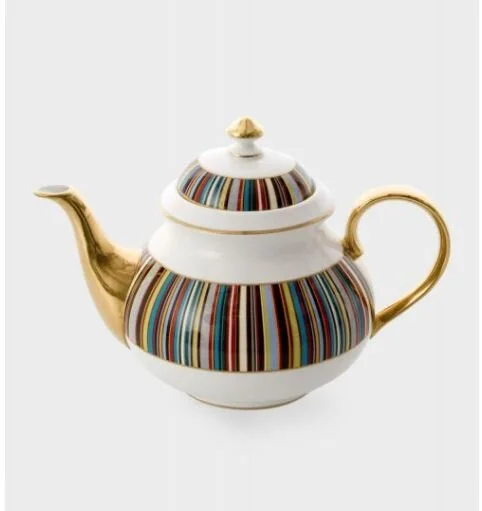
Guests could hIre a Paul Smith Mercian cycle via the hotel for a bike tour around London or they could book a deck chair at Hyde park round the corner (a designer deck chair was created by Paul Smith for London’s Royal Parks charity in 2010) Guests could take home the Paul Smith wash bag in the bathroom for an additional fee or even order one of the artwork prints for their home. Tea could be served in the guestroom in the Thomas Goode tea set designed by Paul too. He has collaborated with many brands like Anglepoise, Leica, Globe-Trotter and Caran d-Ache, however, some hotel guests have stickier fingers than others so featuring the ballpoint pen (£35) that Paul developed with them might be too tempting.
Henry Holland
After working as a stylist and fashion editor, Henry launched House of Holland in the mid-2000s and became a high street name when his slogan t-shirts were shown at London’s Fashion Week 2007 after the last collection was shown. Originally designed for himself and friends, these became a big hit with the public with their 80’s inspired style and rhyming slogans. Holland stands out in order to be noticed and therefore, so must these guestrooms.
The rooms should feature some of this trademark typography with cheeky phrases on artwork, menus, fire escape plans, etc.
Using block colours for the wall finishes in neutral off-whites, dark green and teal tones would create a strong backdrop for the vibrant artwork, lighting, upholstery and accessories. While respecting the structure of the building these vibrant features would attract the eye and make the space feel contemporary. The rooms would keep the traditional late Victorian mouldings, windows and doors. They would be cleaned and repaired before matt paint colours would be added.
Holland’s bold patterns would feature prominently in the rooms creating an energetic feeling with a hint of chaos.
Henry’s 2018 collection was shot against Albert Irvins artwork. It would be nice to honour the mutual appreciation they had for each other’s work by including references to Irvins work in the guestrooms if the Estate of Albert Irvin agreed.
If guests would like to replicate the hotel guestroom in their own home some of the furniture is on sale at a London department store. They could order the exact same pieces to be delivered to their house.
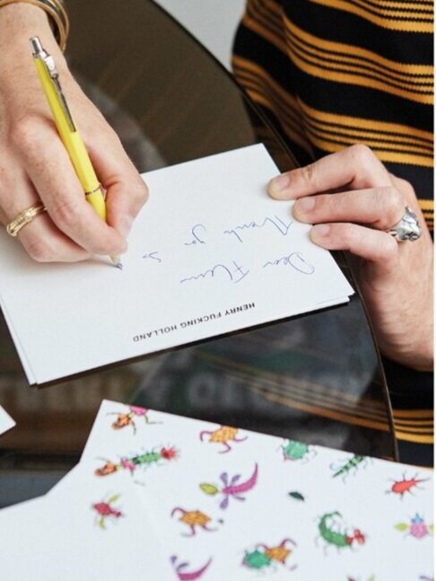
Or if guests would prefer to take a smaller token home as a memento, then a notebook Holland developed with Papier would be in each room as a complimentary gift, also available to guests are the tote bags he developed with Primark. If guests wish to purchase small gifts some Le Specs sunglasses would be available for people to try as well as the Six Scents fragrances. These were both collaborations with the House of Holland too. Although the House of Holland has recently ceased trading Henry continues to design and collaborate with other brands.
This was a quick process with minimal back and forth with the client. Not all projects need a complex narrative or a deep understanding of social behaviour, sometimes they are just looking for some aesthetic flair and talking points to help the staff to engage with the guests and vice versa. Depending on the client, the location, the scope and the hotel guests it’s important to find the right fit for the project. Discussions at the start of a project can identify the opportunities and restrictions. Once the concept is agreed we typically produce plans, elevations, samples and visuals for approval and costing before developing the technical specifications and drawings.
These rooms would make guests feel to these London based designers, help them feel ‘in the know’ and maybe learn or experience something new during their stay too. The individual rooms can have very different styles but they need to compliment the style of the public area by using deep jewel tones, warm neutrals and a careful curation of traditional and modern style furniture.
Collaborators were Gurtake Singh, Philip Twiss, Dan Craner and Anjana Pandya. If the project had not gone on hold while we were developing these ideas we would’ve collaborated with a wider group.


